Design and Process
Visual Identity Design
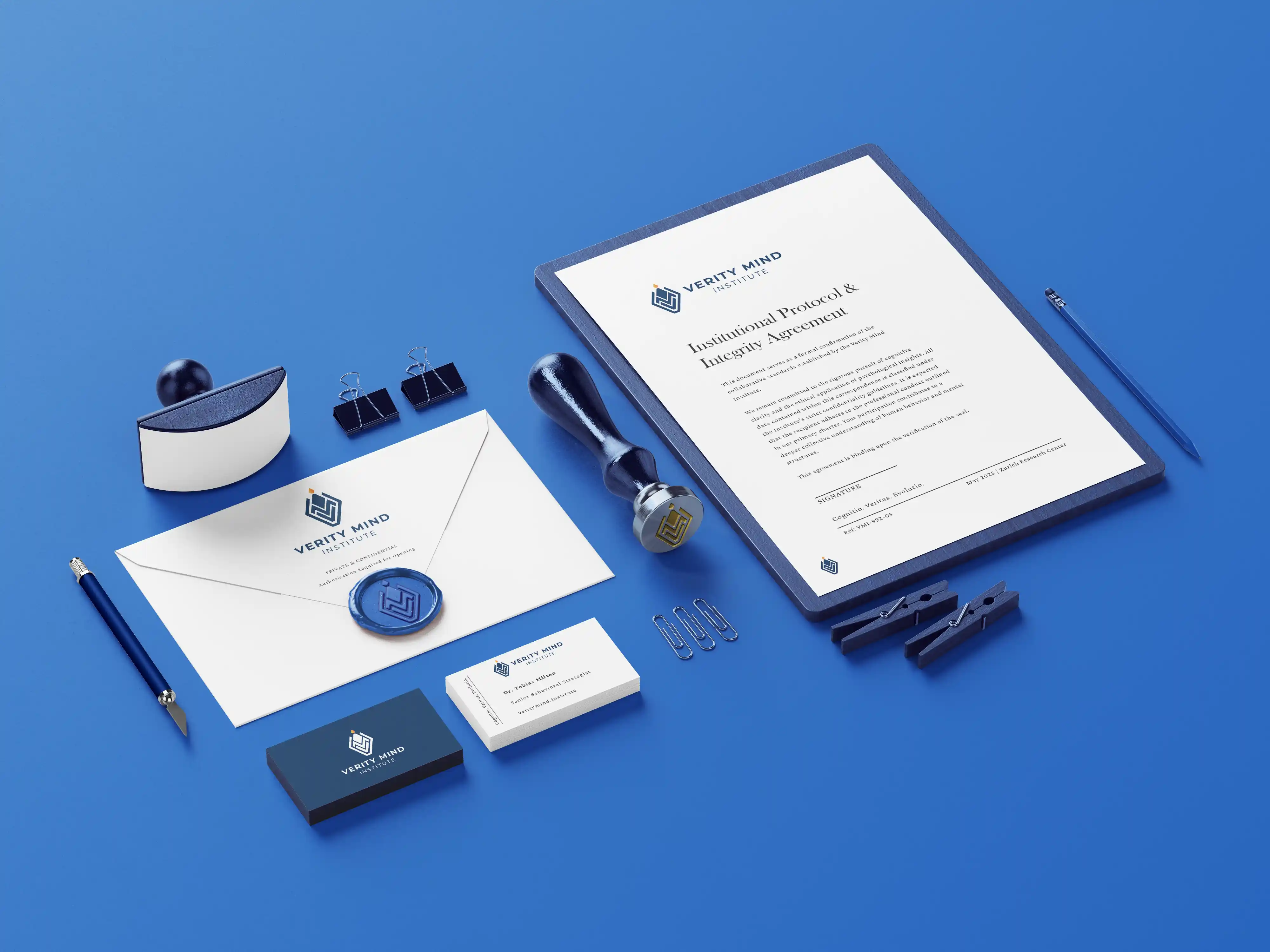
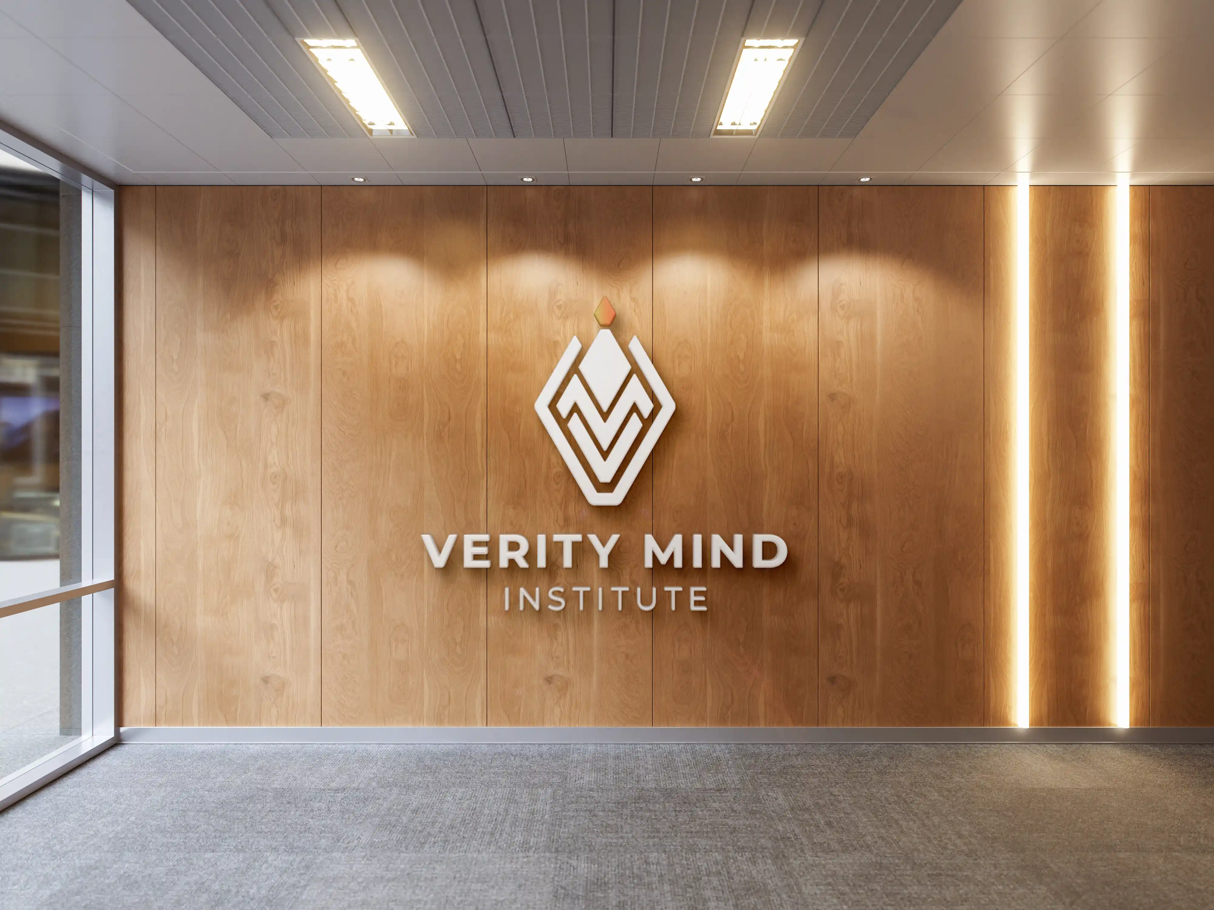
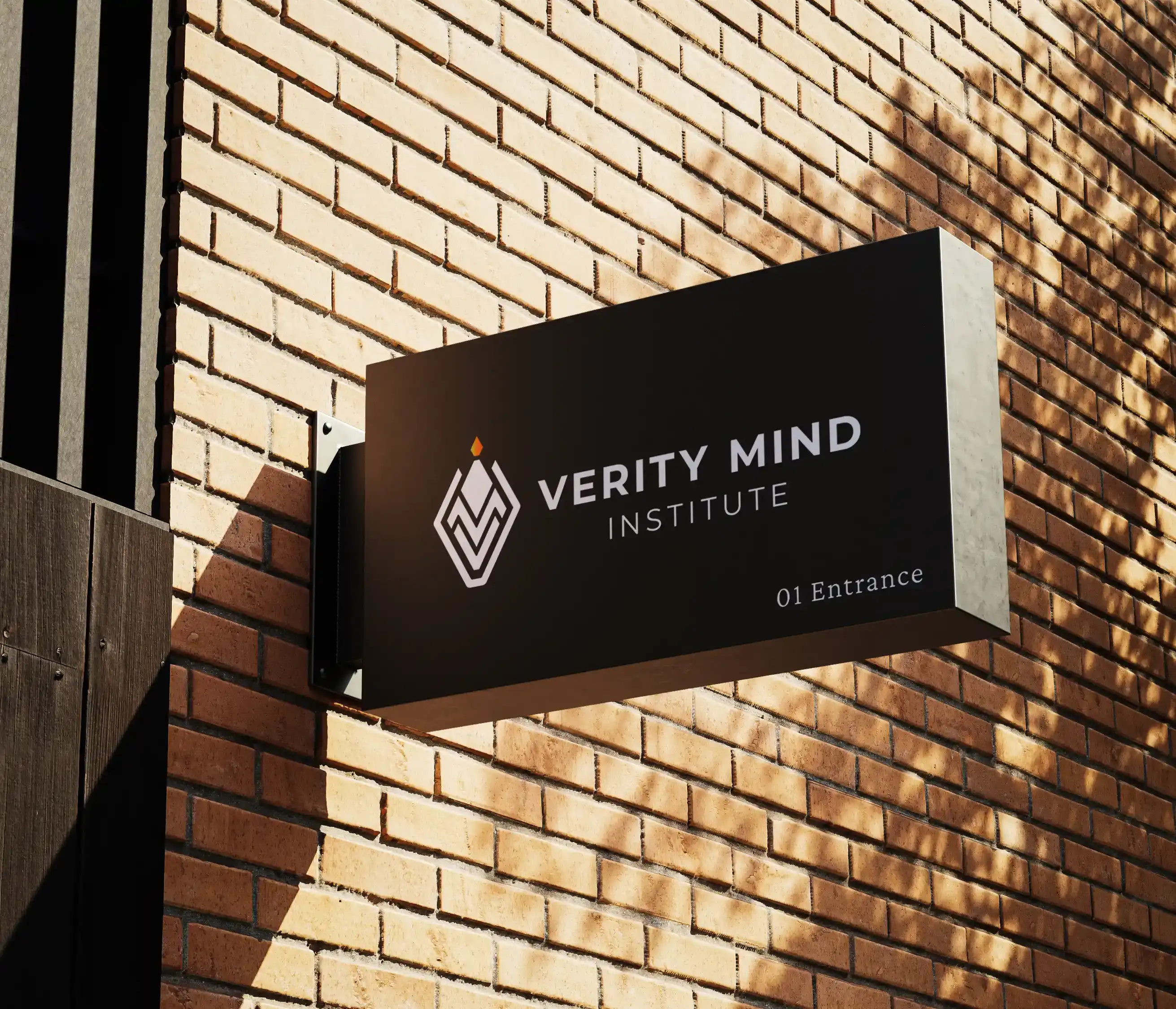
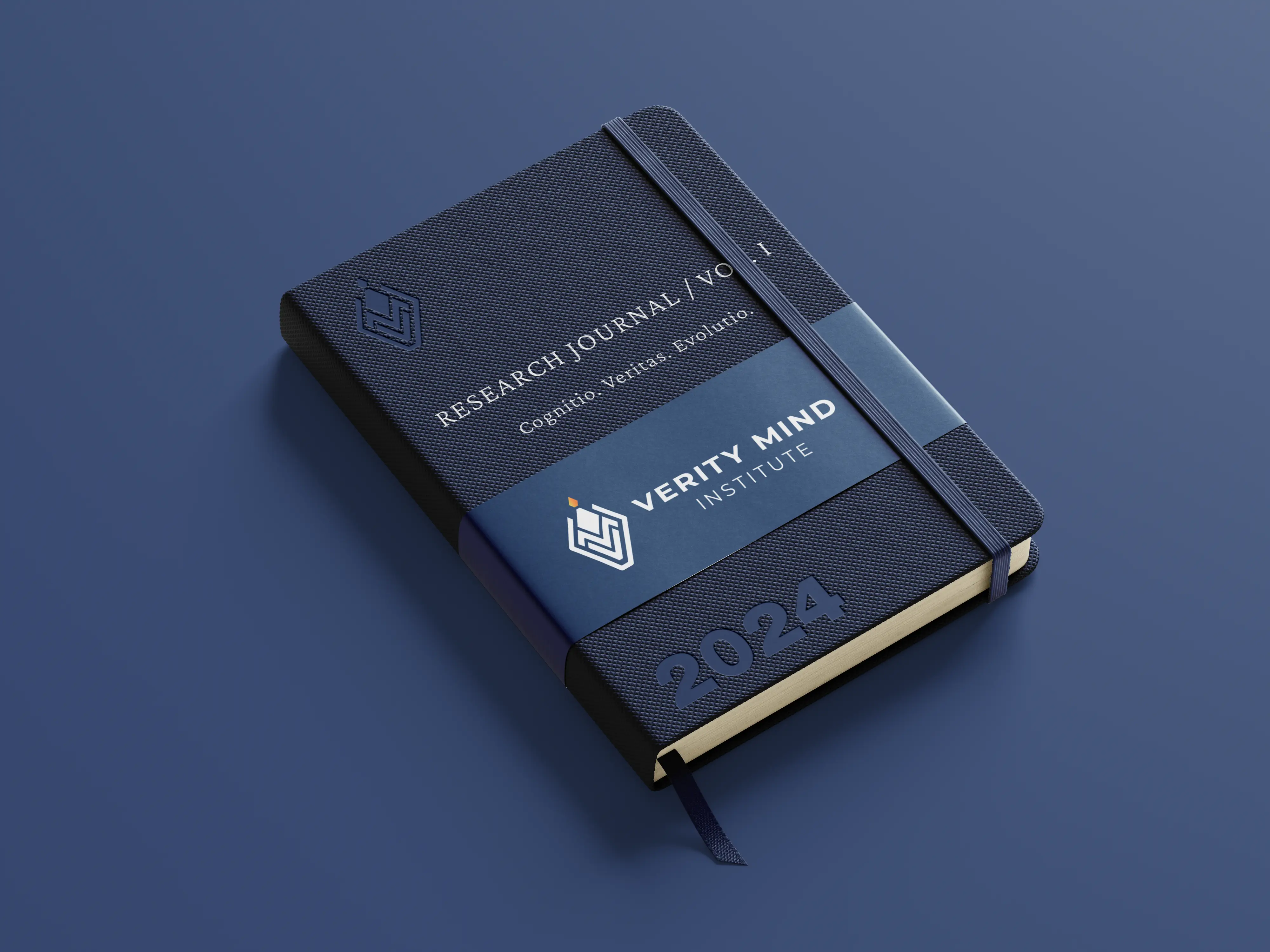
The goal of this project was to create a clean and reliable visual identity for the Verity Mind Institute — one that communicates professionalism, trust, and authority without feeling outdated or overly complex. The focus was on building a flexible visual system that could maintain consistency across different applications, from small printed materials to large-scale environmental graphics and corporate assets.
The final identity establishes a strong and credible presence for the institute, combining a contemporary visual language with a sense of stability and tradition. The result is a system designed to feel clear, trustworthy, and built to represent an organization where expertise and important decisions take center stage.

The process began by exploring geometry, balance, and symmetry as the foundation of the identity. The goal was to create a visual language that feels stable, precise,
and trustworthy. For the logo typography, a clean sans-serif typeface was selected to ensure clarity and readability, while the wider brand system uses a Garamond-inspired
serif to introduce a sense of heritage, intelligence, and refinement.
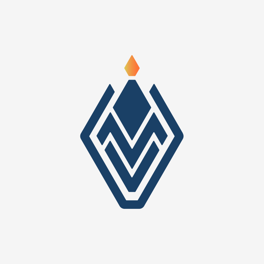
The central element of the identity is a subtle interlocking monogram that combines the letters V, M, and I into a unified symbol. The structure was carefully built around
a symmetrical diamond shape with softened corners, creating a balance between precision and approachability. At the top of the mark, the letter "I" transforms into
a torch symbol, representing knowledge, guidance, and clarity.
An outer frame follows the structure of the monogram, reinforcing the ideas of protection, reliability, and institutional strength. The primary color palette is
built around deep navy blue, chosen to support the brand's qualities of trust, intelligence, and professional stability.
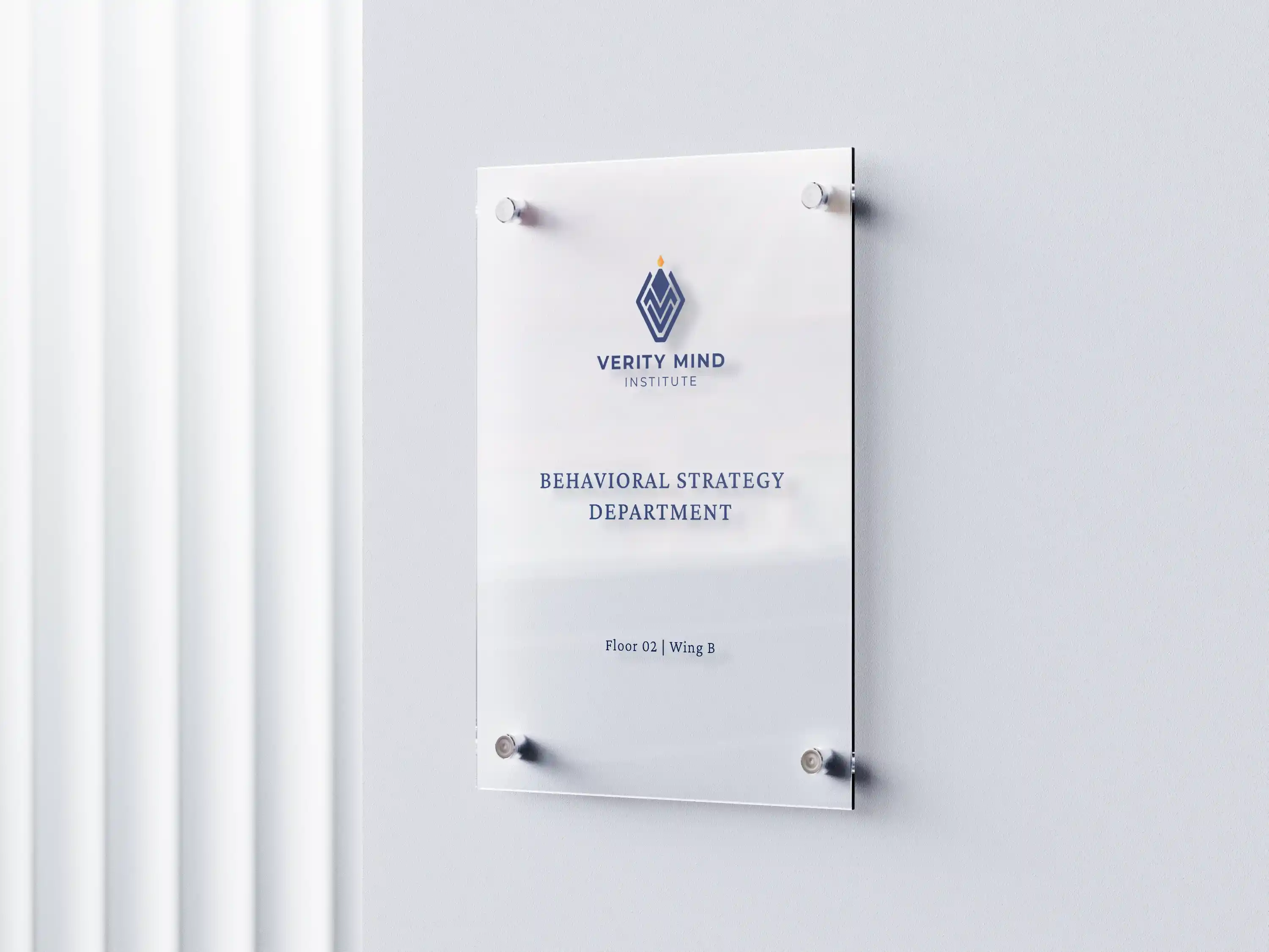
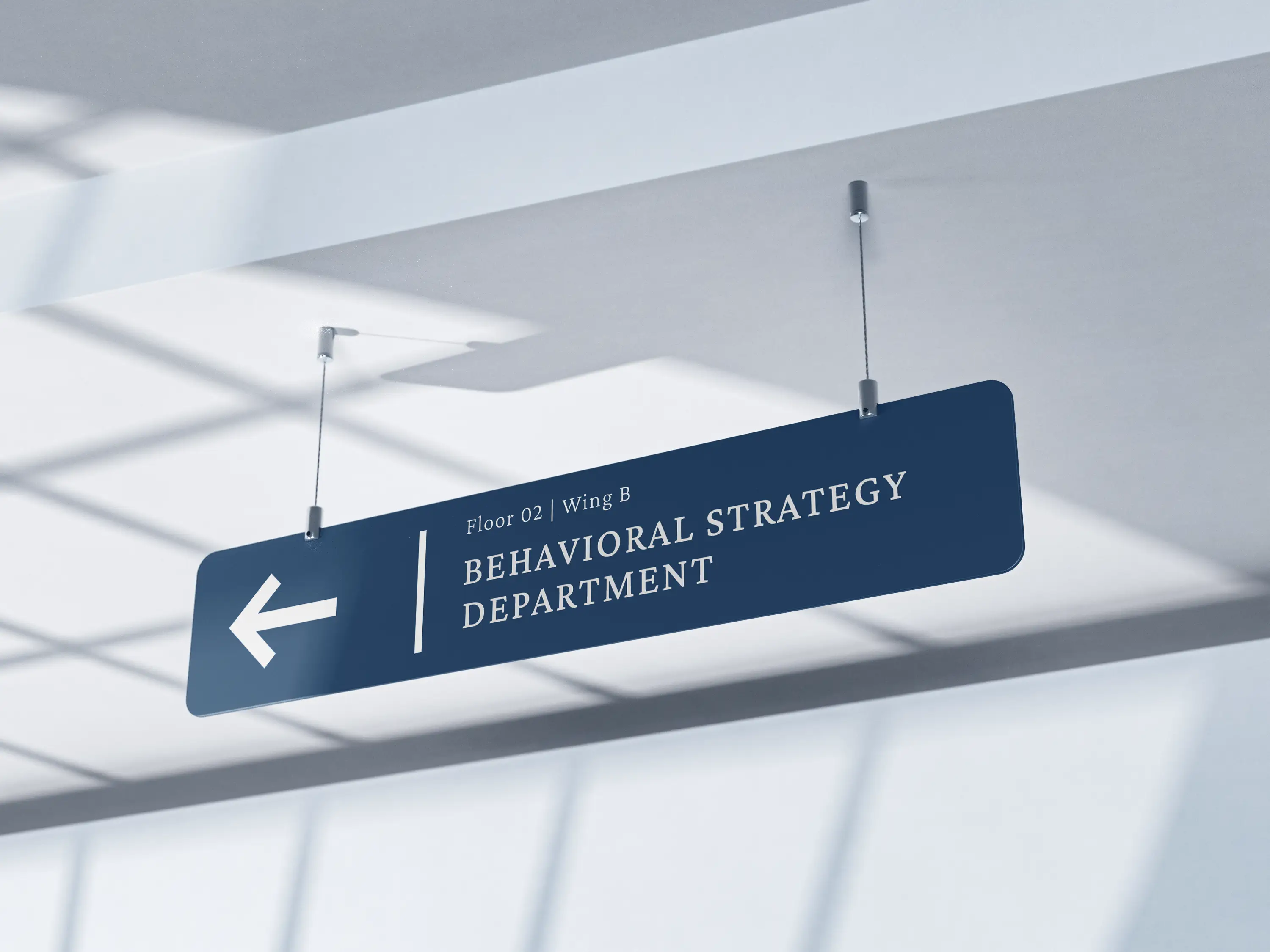
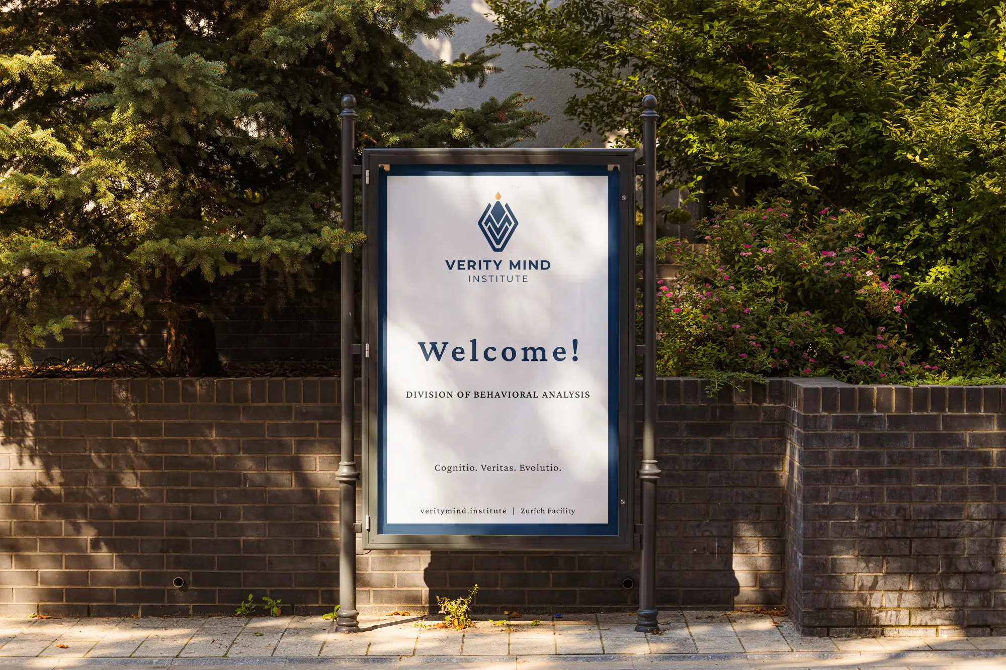
To ensure the identity could function across different touchpoints, the system was expanded with a horizontal logo variation, a simplified icon, a logo reveal animation,
and applications across print materials and environmental signage.
The logo reveal was designed with a minimal and refined approach, reflecting the professional character of the Verity Mind Institute. Lasting five seconds,
the animation gradually builds the identity by revealing the VMI monogram layer by layer, with each letter appearing in sequence to create a sense of structure and order.
As the core symbol takes shape, the flame detail emerges at the top, followed by the enclosing frame and the wordmark, completing the full identity reveal.
The animation is supported by carefully timed sound design, where each transition is enhanced by subtle rhythmic elements that add depth and reinforce the sense of progression.
Created entirely in Adobe After Effects, the reveal was built using the same vector shapes from the original logo, ensuring visual consistency between the static and animated identity.
Designed as a flexible brand asset, it can be used across promotional videos, social media content, website introductions, presentations, and pitch decks.
A strong identity is more than a visual mark — it is the foundation of how an organization communicates its values, expertise, and purpose.
Thoughtful design creates recognition, builds confidence, and helps brands establish a lasting presence.
If you're looking to create an identity that reflects the strength of your vision, I'd love to hear your ideas.