Design and process


Visual Identity & Guidelines Design
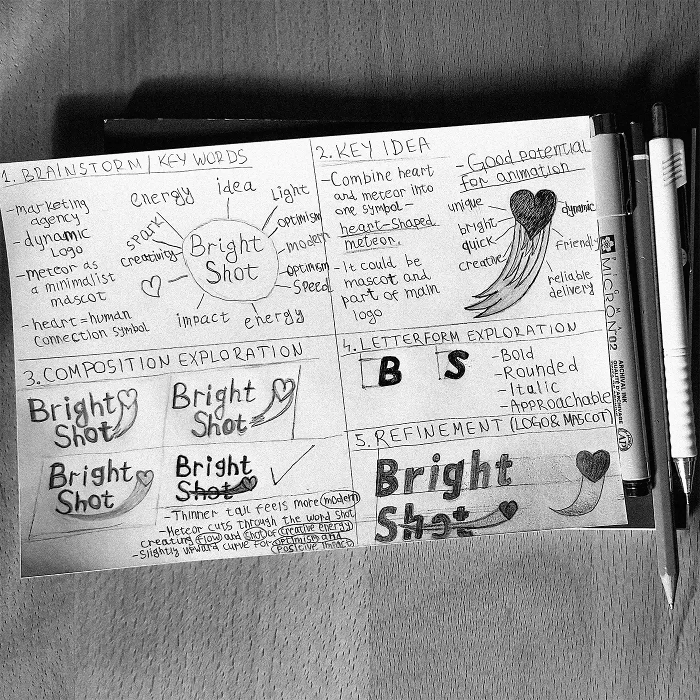
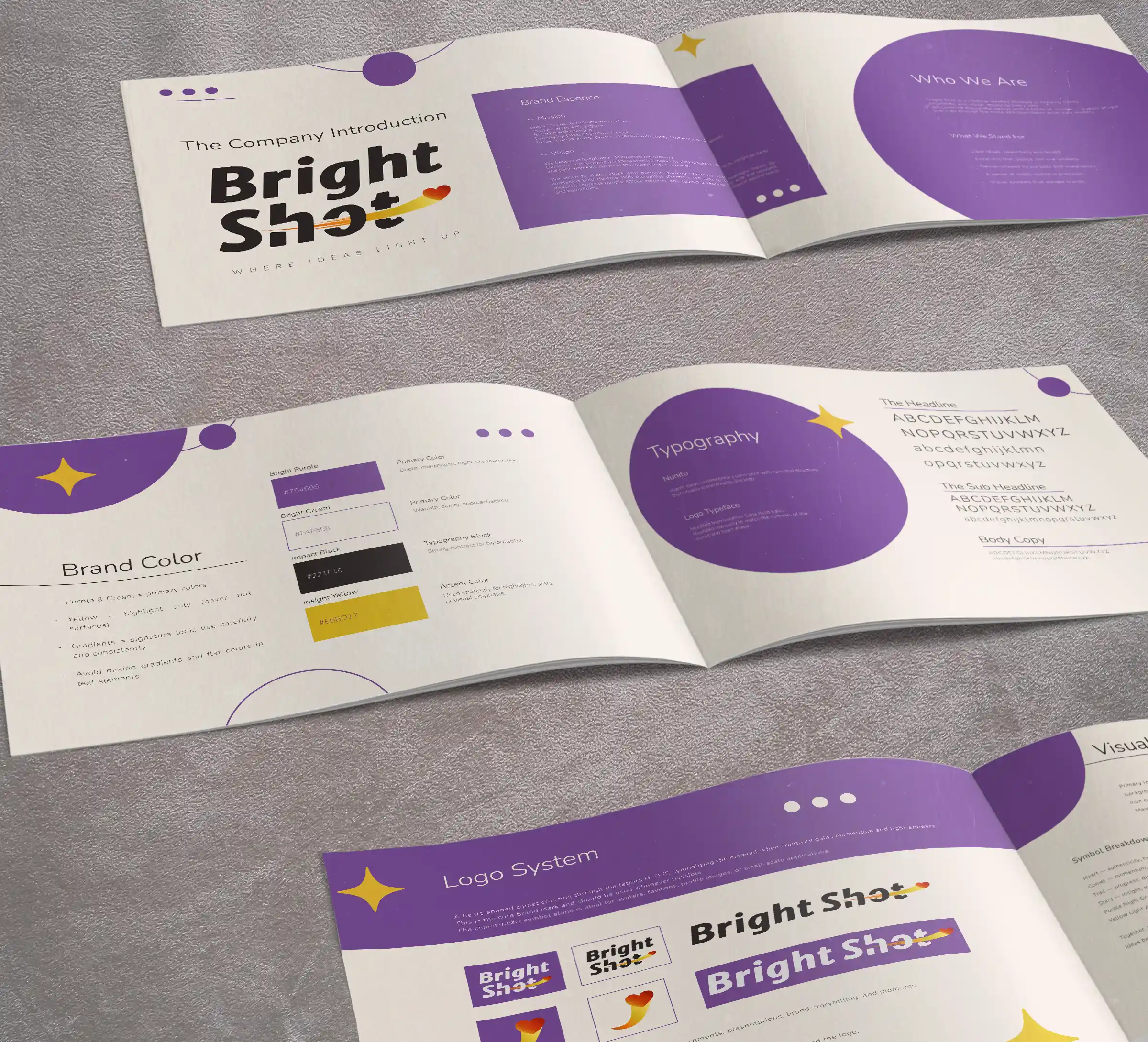
Bright Shot is a visual identity created for a modern marketing agency that combines strategic thinking with creative execution. Inspired by the tagline
"Where Ideas Light Up," the identity explores the moment when an idea gains momentum and evolves into meaningful creative work. At the heart of the system
is a custom wordmark featuring a heart-shaped comet that breaking through the letters of SHOT, visually capturing the transition from inspiration to action.
The symbol represents creativity, momentum, optimism, and authentic human connection — the qualities that define both the agency's approach and the outcomes
it strives to create. The project was further expanded into a complete visual identity system, including brand guidelines, a logo opener, and a range of digital
and print applications demonstrating the brand across multiple touchpoints.


The project began by positioning Bright Shot as a creative marketing agency with an approachable, optimistic, and energetic personality rather than a traditional
corporate brand. This concept became the basis for the custom logo, where a heart-shaped comet rises through the letters of SHOT, creating a sense of movement while visually
reinforcing the brand name. The upward trajectory symbolizes progress, optimism, and measurable results, while the heart represents successful connection between a brand and its audience.
To reinforce the agency's approachable personality, a custom rounded wordmark was developed from sans-serif font, balancing professionalism with warmth,
while the italic construction subtly enhances the sense of movement
already established by the symbol.
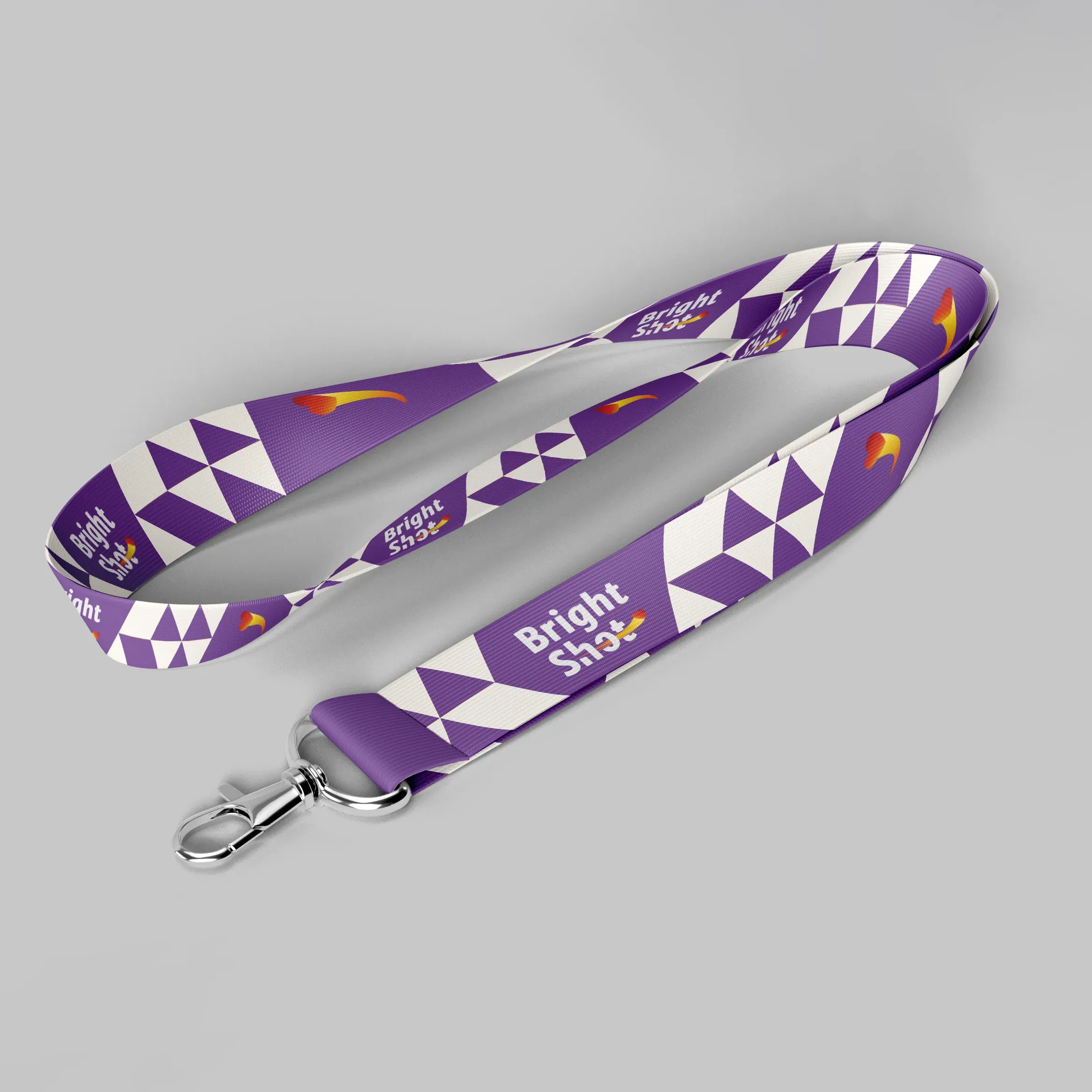
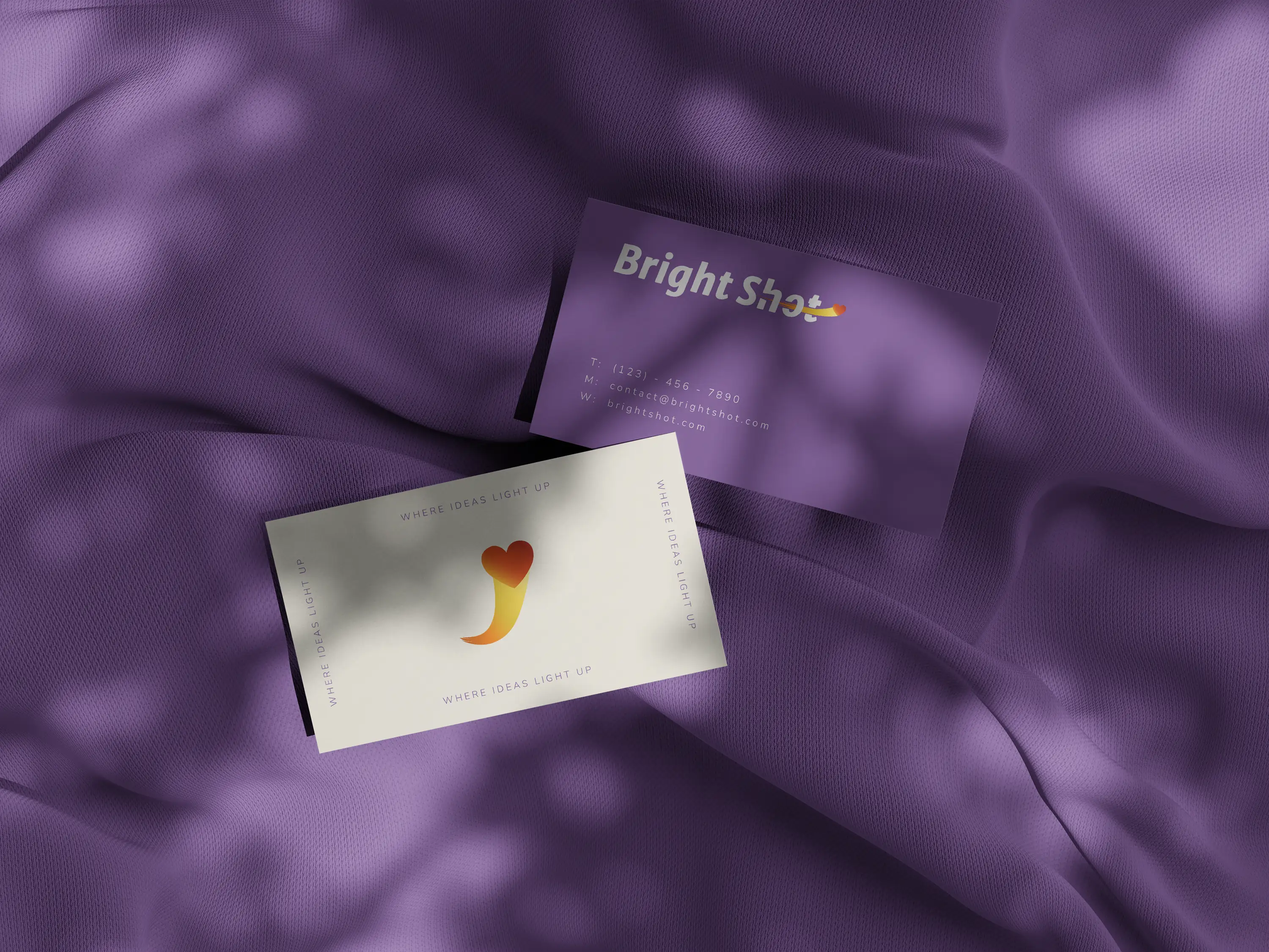
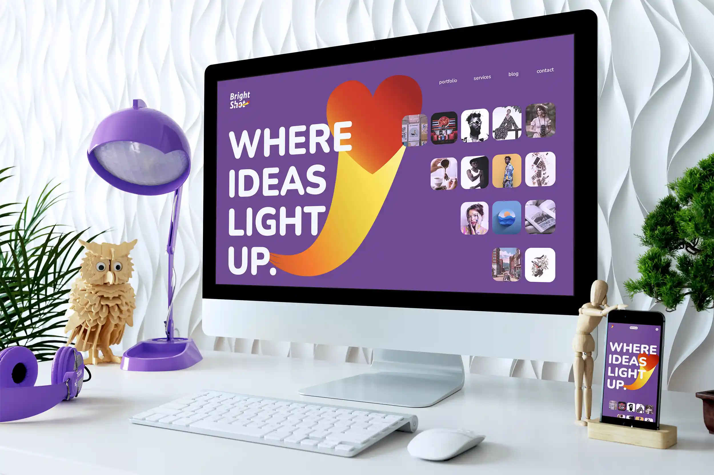
Supporting graphic elements were derived directly from the logo, allowing the heart-shaped comet to function as a recognizable
standalone brand asset across both digital and print applications. Multiple logo configurations were developed to ensure flexibility across different formats, including
horizontal lockups, different colors, and tagline variations. A concise set of visual identity guidelines established the core rules for logo usage, typography, color,
and supporting graphics, ensuring consistency throughout the system.
Finally, the identity was extended into real-world applications and brought to life through a custom
logo opener, translating the brand's central ideas of movement, energy, and illumination into motion.



The logo opener was designed as an extension of the brand identity, translating its core ideas into motion while preserving the symbolism established in the visual
system. Set against a star-filled night sky, the animation follows the journey of the comet as it travels across the screen, leaving behind trails of
light that gradually reveal the Bright Shot logotype.
The animation tells a concise visual story of an idea gaining momentum,
overcoming obstacles, and reaching its destination—heart,
symbolizing the successful connection between a brand and its audience.
Sound design was carefully integrated to emphasize speed, impact, and movement, while a subtle
ambient soundtrack and voice-over reinforce the brand message without distracting from the visuals. Built entirely from vector-based assets and animated in
Adobe After Effects, the opener ensures consistency with the visual identity while adding an engaging motion layer suitable for digital platforms.
Every successful brand begins with an idea, but it is clarity that gives it direction. Through thoughtful strategy, distinctive visual identity,
and purposeful design, complex ideas become clear, memorable, and ready to connect with the right audience.
If you're ready to turn your vision into a brand people remember, I'd love to hear your ideas.