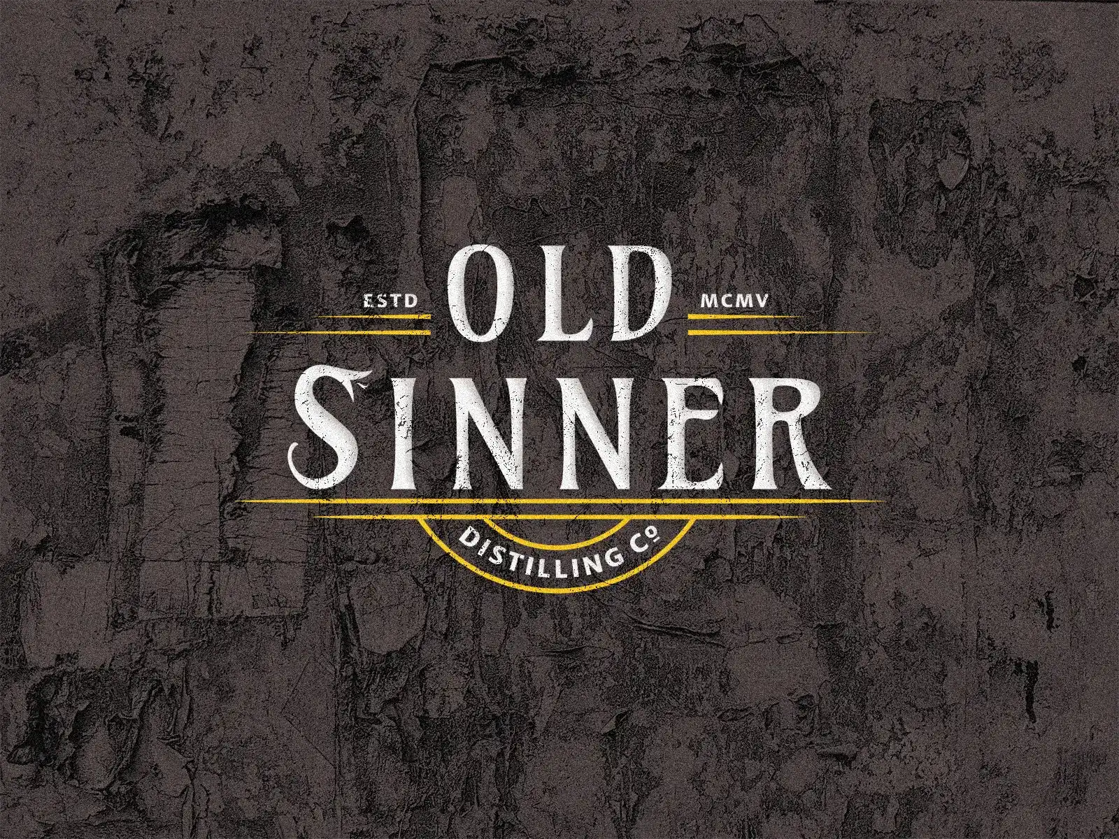


The design process began by exploring historic American distillery branding from the early 1900s, focusing on visual elements that conveyed heritage without
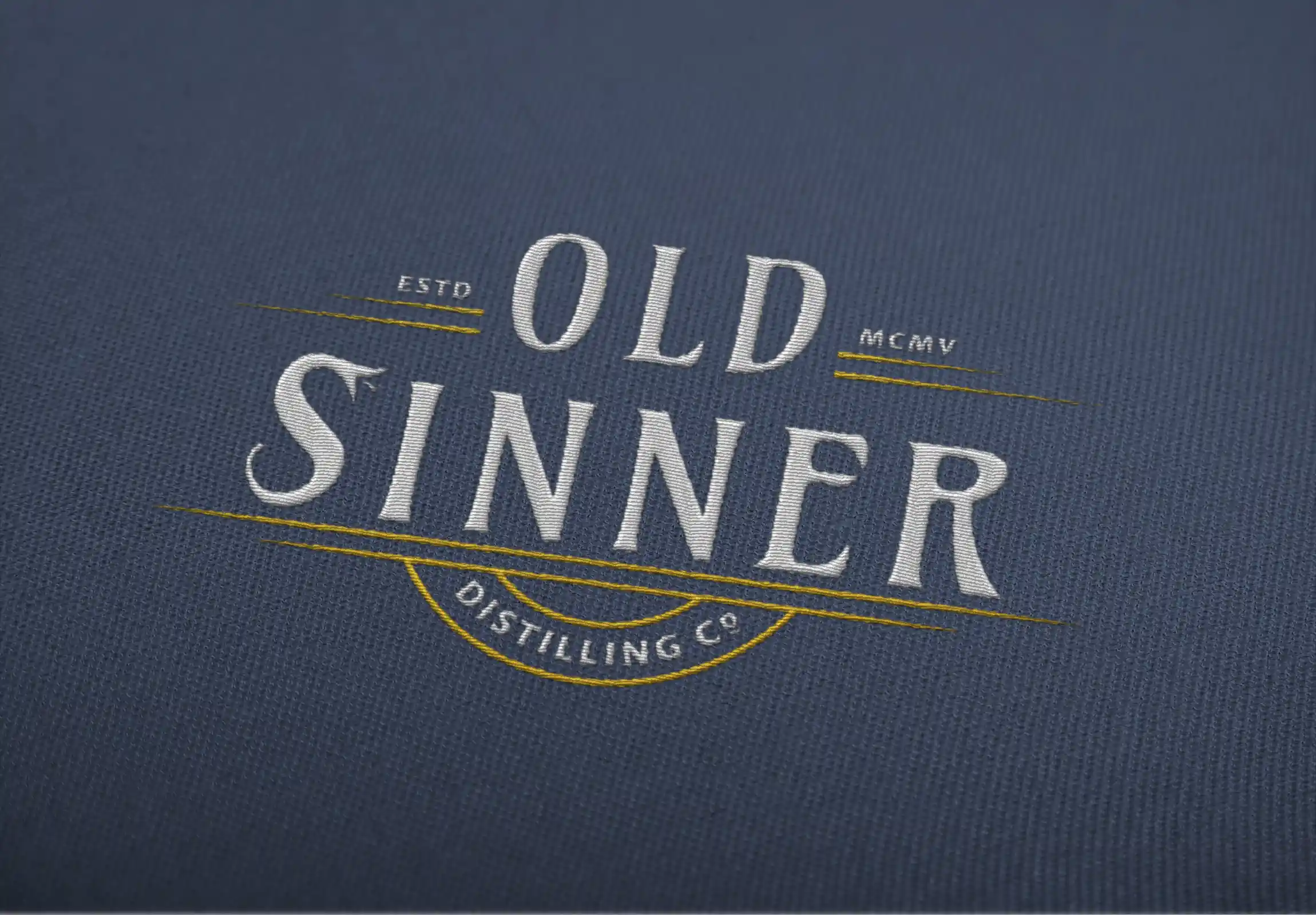
feeling overly decorative. The typographic direction was built around a typeface inspired by Art Nouveau aesthetics, reflecting the artistic influences of the
early twentieth century. Combined with the project's frontier heritage references, it strengthens the identity's sense of authenticity while complementing the
handcrafted details throughout the visual system.
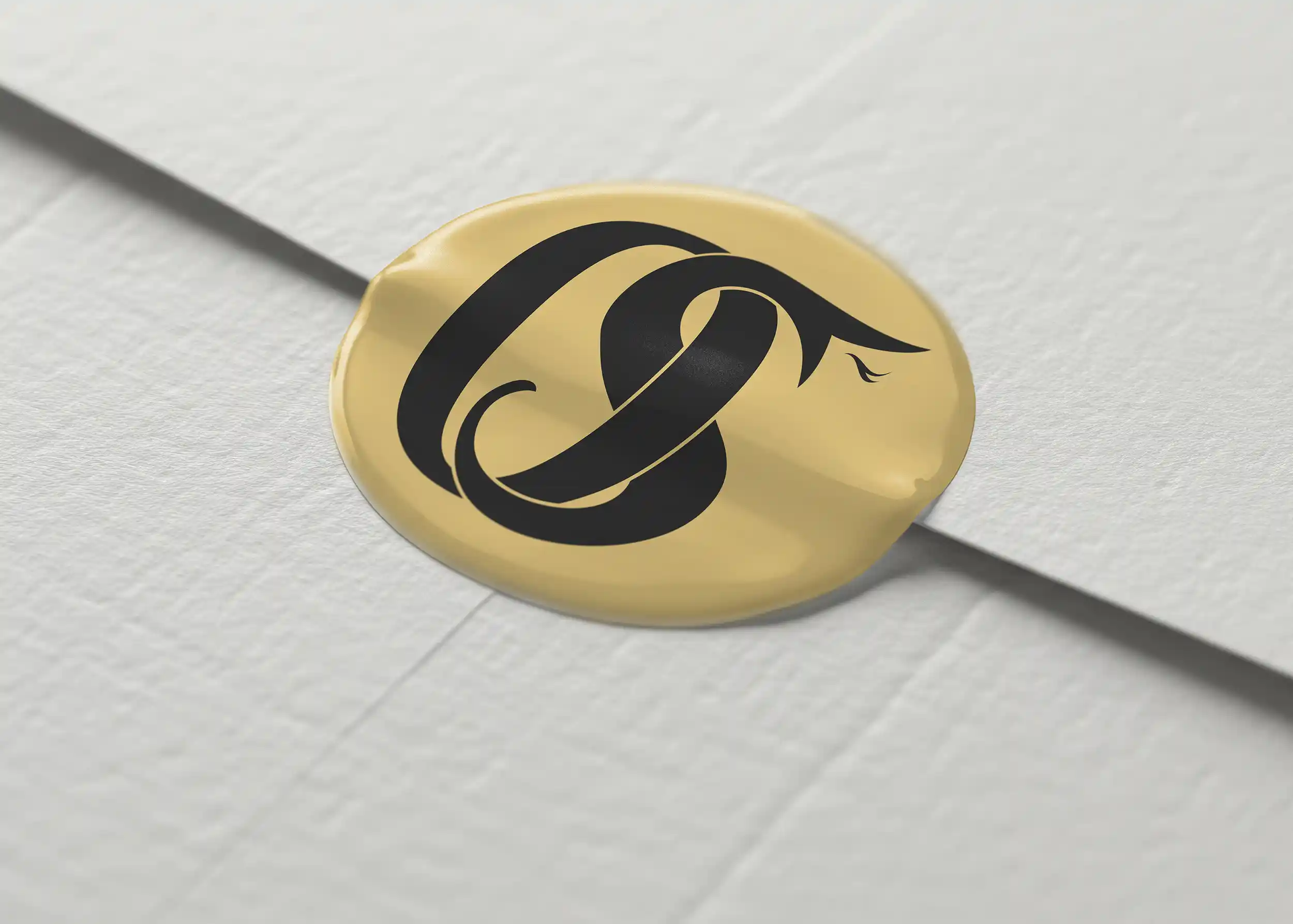
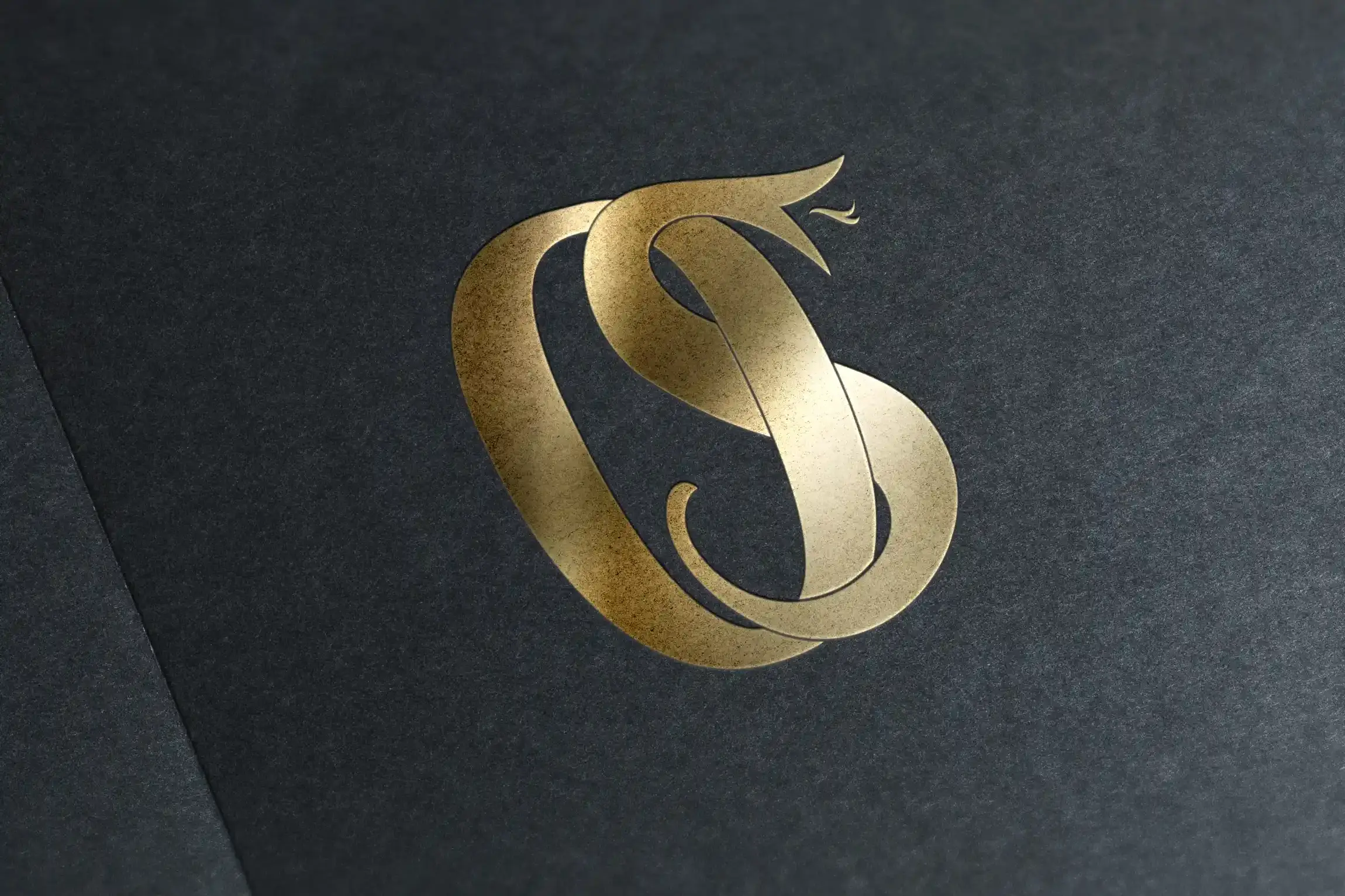
The identity was built around a strong typographic foundation, and custom hand-drawn snake representing the concept of sin—the defining symbol of the brand.
The illustration was first sketched by hand, then vectorized and refined to match the weight and character of the lettering.
Integrated into the enlarged initial "S", the symbol becomes a subtle focal point that reads as a standard letter from a distance
while revealing its illustrated form on closer inspection.
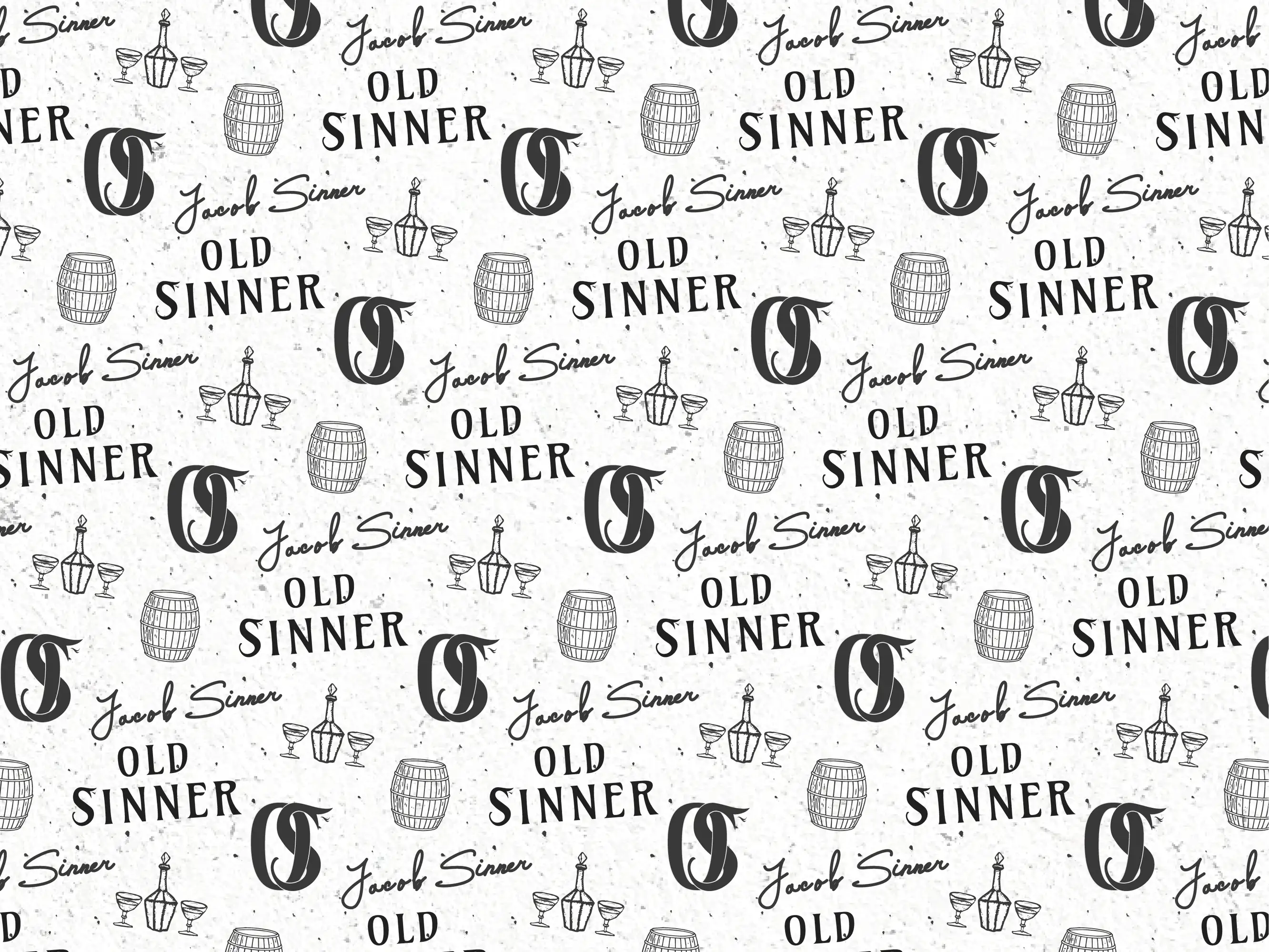
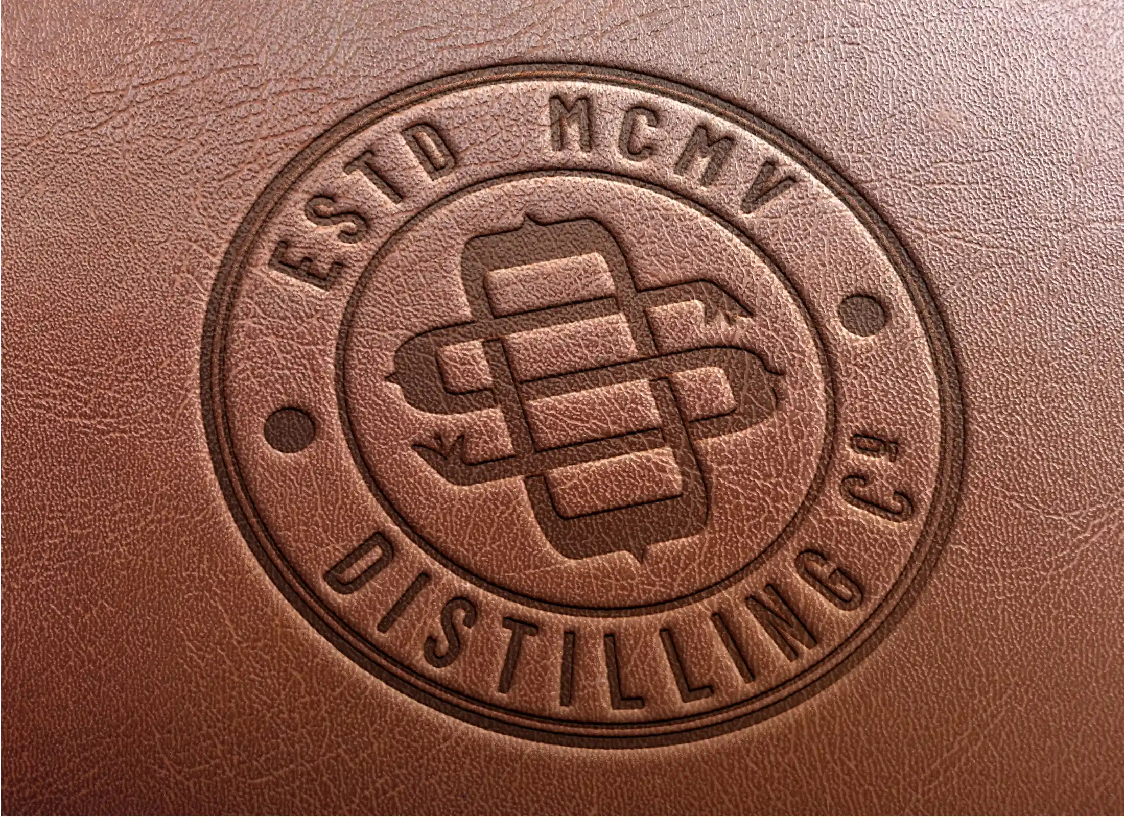
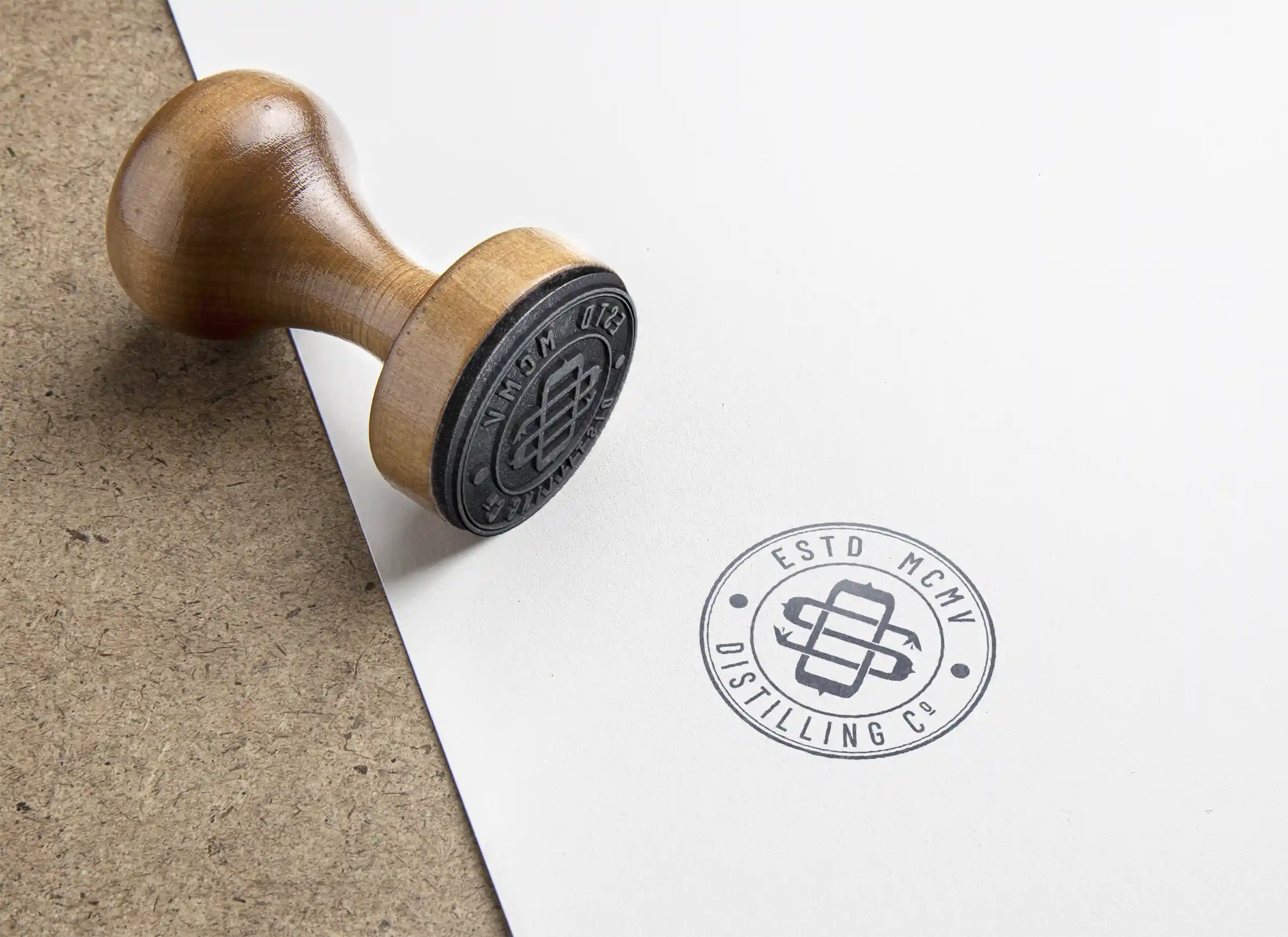
This visual language was then expanded into a complete system of supporting assets, including the monogram,
stamp, and pattern, ensuring consistency across every application. Multiple logo variations were developed to provide flexibility across different print formats while
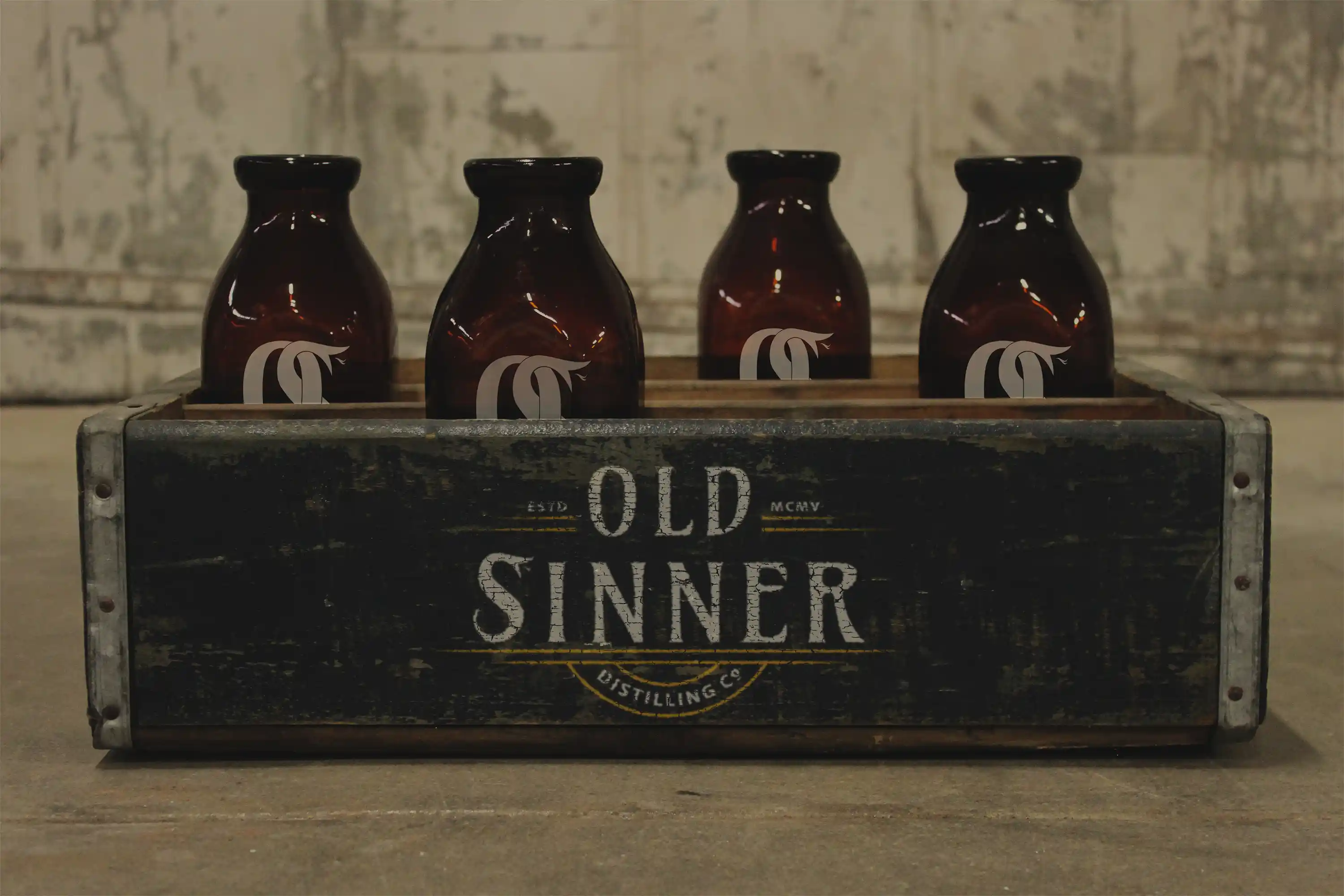
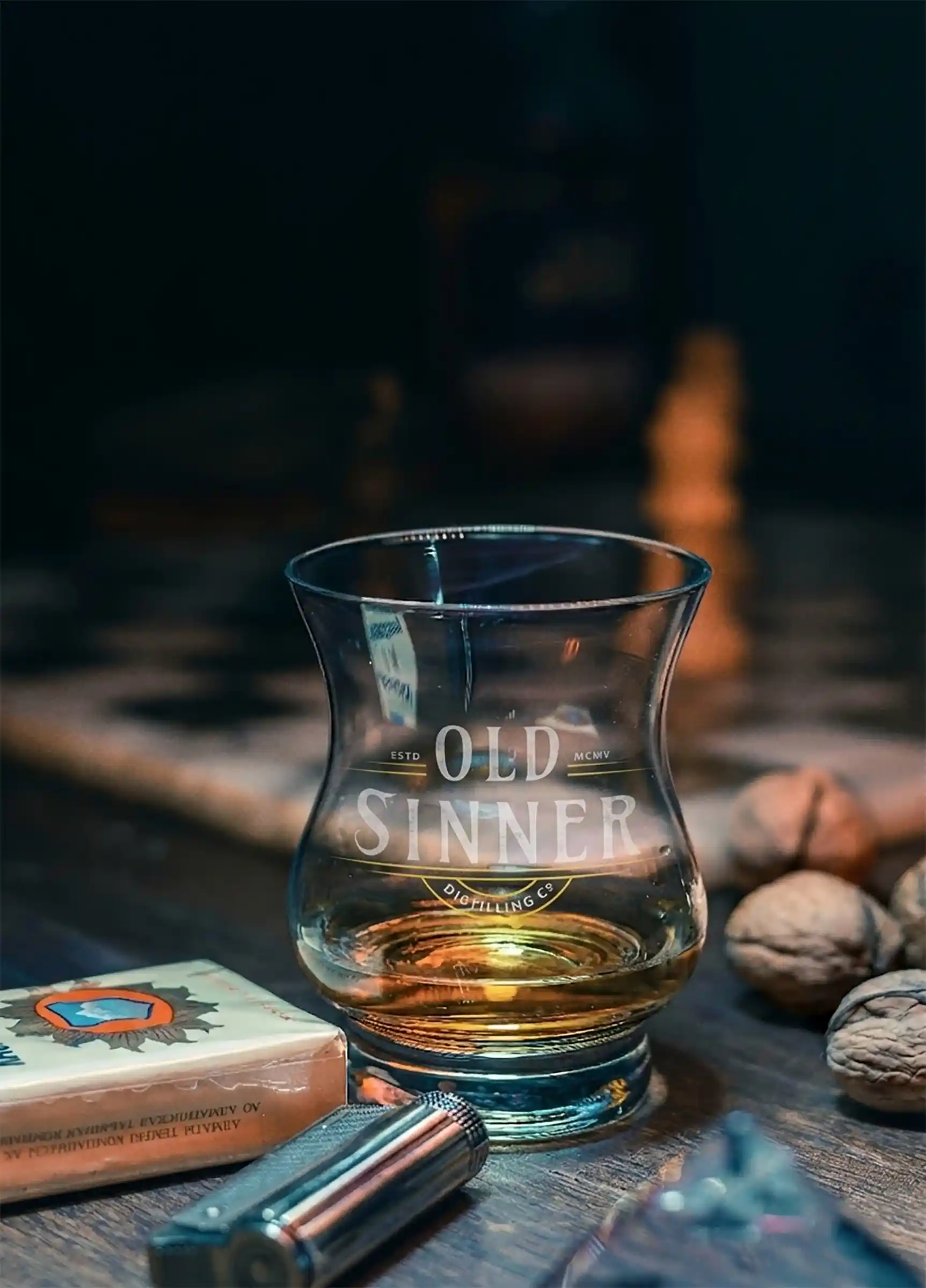
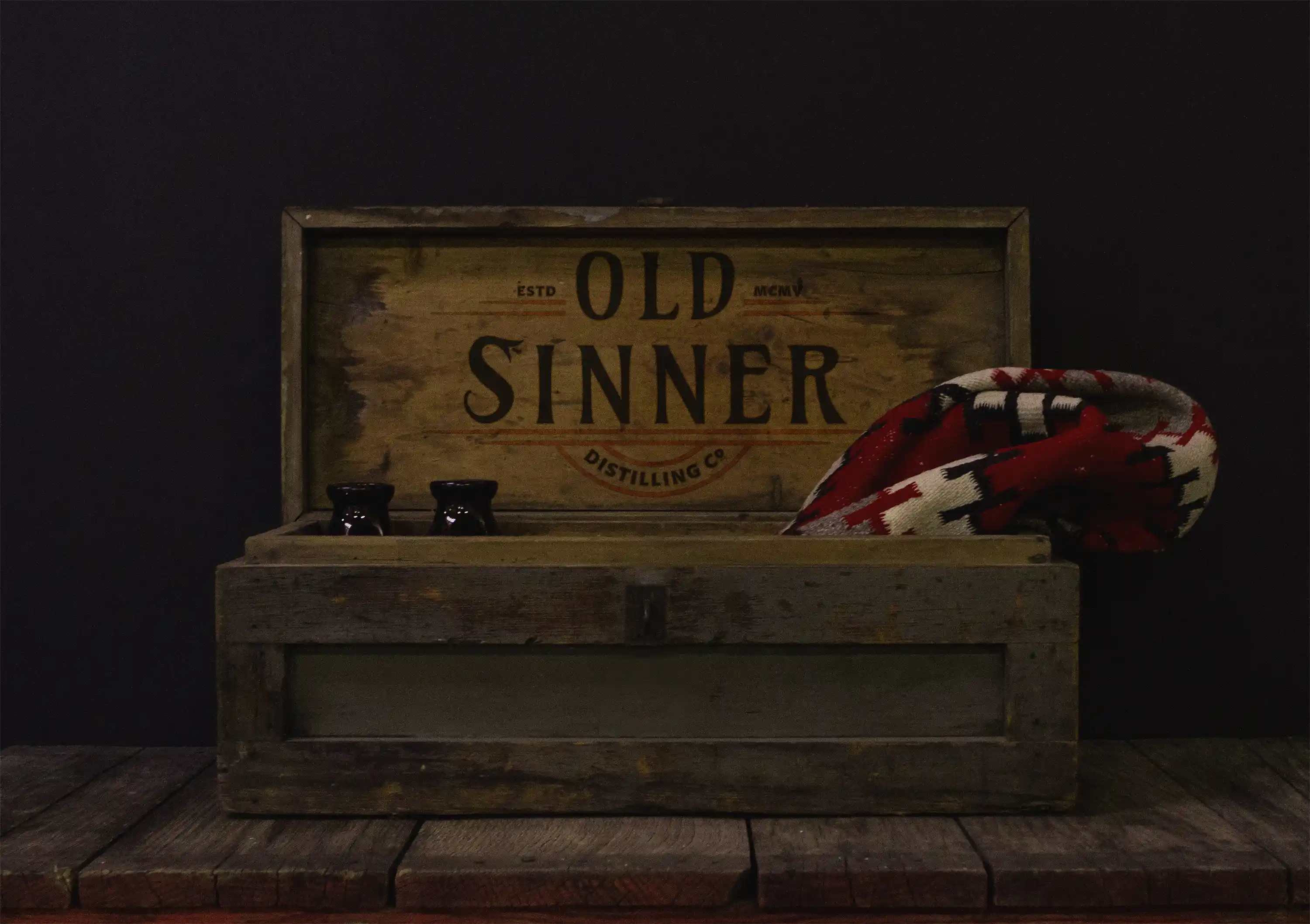
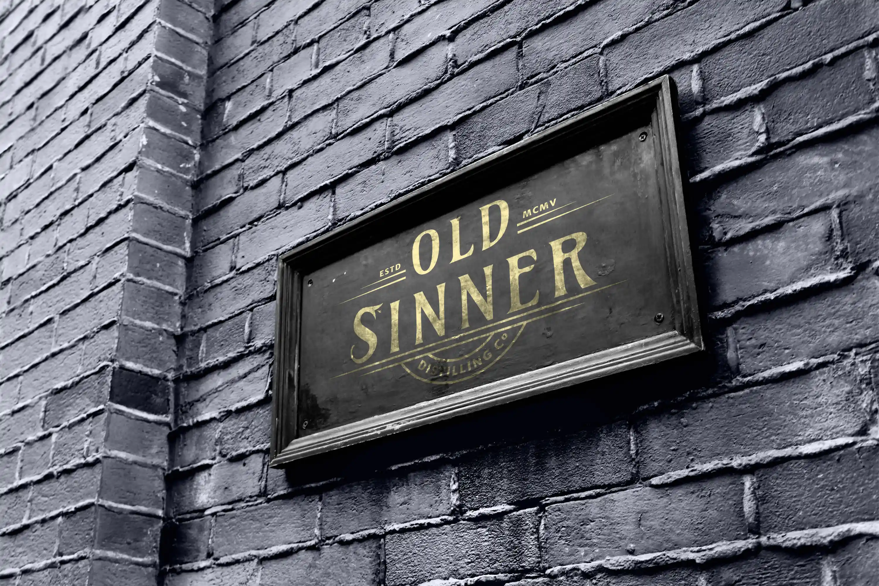
preserving the identity's character and recognizability. The project concludes with a series of print applications and experimental compositions, demonstrating how the
identity can adapt across a variety of brand touchpoints without losing its distinctive personality.
Crafting a Legacy
The most memorable brands feel as though they've always existed. Through thoughtful storytelling, timeless typography, and carefully considered details,
visual identity can create a sense of heritage that resonates long before a single word is read.
If you're ready to build a brand with character, history, and lasting impact, I'd love to hear your ideas.